Teardowns
The anatomy of a promo email that doesn't feel cheap
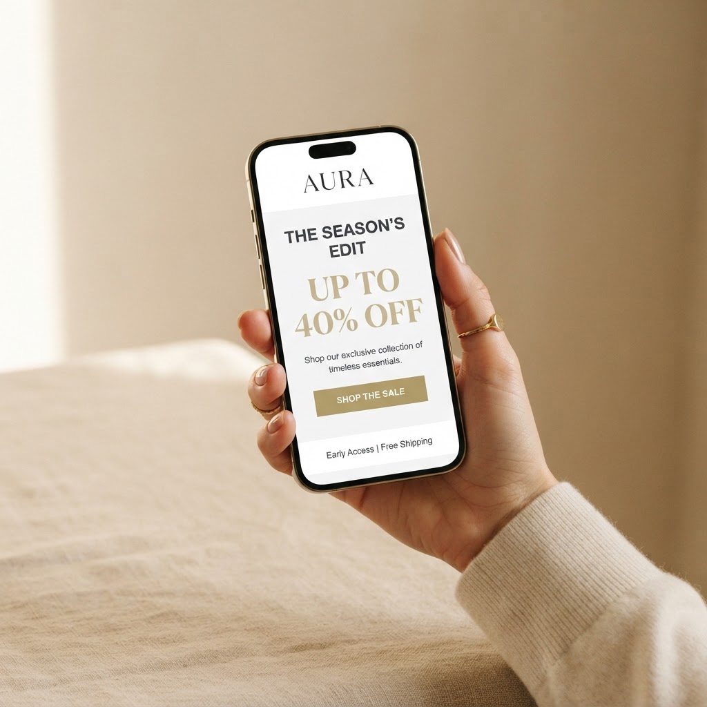
Promo emails have a reputation problem. Done badly, they feel like a man shouting into a megaphone. Done well, they feel like a friend letting you in on something.
The difference isn't the discount. It's the structure.
The subject line
The best promo subject lines don't scream. They create curiosity or urgency without the all-caps and emoji overload. "A little something for your inbox" outperforms "🔥🔥 MEGA SALE 🔥🔥" more often than you'd think.
The opening
Start with the reader, not the offer. One sentence that names the moment — a season ending, a restock, a thank-you — before you ask for anything.
The offer
Make it clear and singular. One discount, one code, one deadline. Choice paralyzes; clarity converts.
The proof
A line of social proof — a review, a number, a name — does more work than a paragraph of adjectives.
The button
One call to action. Big enough to tap with a thumb on a phone in a moving subway.
The best promo emails in the library follow this shape. The worst ones skip the opening and the proof and go straight to the button. You can guess which ones sell.